
11 Ways to Optimize Website User Experience in 2025

To optimize website user experience in 2025, focus on speed, simplicity, personalization, and smart assistance through AI chatbots. A well-designed website should load fast, guide users effortlessly, adapt to mobile devices, and use chatbots to provide instant support and personalized recommendations. Improving website user experience means reducing friction at every step, from navigation to checkout, while ensuring accessibility for all users. The following 11 methods will help you create a smooth, engaging, and conversion-focused online experience that meets modern user expectations and boosts your SEO performance.
📑 Table of Contents
Key Highlights
| Speed optimization boosts engagement and conversions. Simplified navigation enhances the user journey flow. Mobile-first design drives better accessibility. Personalized AI experiences improve user retention. Continuous UX testing ensures long-term success. |
What Is Website User Experience & Why Does It Matter?

Website user experience (UX) encompasses every interaction visitors have with your site: visual design, speed, navigation, and content readability. All of it. Research shows 88% of online consumers won’t return after a bad experience, and 53% of mobile users abandon pages that take longer than three seconds to load. Google’s Core Web Vitals (Largest Contentful Paint, First Input Delay, and Cumulative Layout Shift) now directly impact search rankings. Good user experience websites optimize these metrics while anticipating user needs.
The money side? Forrester Research found better UX design and better website user experience yields conversion rates up to 400%. Amazon calculated that every 100 milliseconds of latency costs them 1% in sales. Best user experience websites understand user psychology. Web visitors scan in an F-shaped pattern, and Jakob’s Law states users prefer familiar interfaces. This guide presents 11 proven strategies to enhance user experience on websites, drawn from the best user experience design websites, with actionable user experience design techniques for your user experience portfolio website.
Start Optimizing Now
11 Ways To Optimize Website User Experience
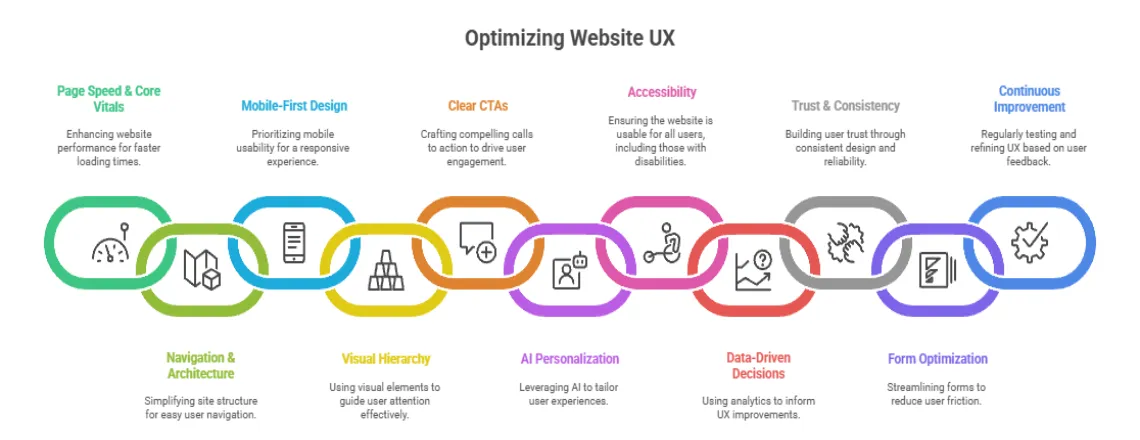
1. Improve Page Speed & Core Web Vitals

Fast-loading pages are the backbone of a strong website user experience. In 2025, users expect instant responses. Optimize images, leverage caching, and use a Content Delivery Network (CDN) to minimize delays. A site that loads in under three seconds improves engagement and boosts SEO rankings.
Core Web Vitals provide the technical foundation
- Largest Contentful Paint (LCP): Measures loading performance. Should occur within 2.5 seconds.
- First Input Delay (FID): Measures interactivity. It should be less than 100 milliseconds.
- Cumulative Layout Shift (CLS): Measures visual stability. Should be below 0.1.
Measure your current performance using Google PageSpeed Insights, GTmetrix, or WebPageTest. These tools identify bottlenecks from unoptimized images to render-blocking JavaScript.
What to implement
- Implement lazy loading for images and videos
- Minimize and compress CSS and JavaScript files
- Use CDNs to serve assets from locations closer to users
- Enable browser caching for static resources
- Convert images to WebP format
- Reduce server response time through better hosting or caching layers like Redis or Varnish
- Remove unused CSS and JavaScript
- Implement critical CSS inline
Pinterest cut wait times by 40% and increased SEO traffic by 15% by prioritizing speed. Faster sites directly improve the website user experience.
2. Simplify Navigation and Site Architecture

Intuitive navigation is key to a seamless website user experience. Navigation acts like your website’s table of contents. When users can’t find what they need quickly, they leave. The three-click rule (yeah, it’s old school) still captures something important: making information easy to reach.
Strong information architecture makes complex content feel simple. Best user experience design websites organize everything logically, using labels that match how users actually talk instead of company jargon.
Steps to take
- Cap main navigation at 5-7 items
- Stick with standard positions (horizontal top or vertical left)
- Add a prominent search function for content-heavy sites
- Use breadcrumbs showing site hierarchy
- Skip dropdown menus needing precise mouse control on mobile
- Try mega menus for complex sites
- Ensure every page has a clear path to the homepage
- Test navigation labels through card sorting with real users
User experience design website examples like Airbnb show how simplified navigation cuts decision fatigue. They spotlight common user journeys (searching destinations, browsing properties, managing bookings), making paths obvious while keeping secondary options accessible.
3. Design for Mobile First

With over 58% of traffic from mobile devices, mobile-first design is essential for website user experience. Google’s mobile-first indexing means the search engine mainly uses mobile versions for indexing and ranking. Yet tons of websites treat mobile like an afterthought, creating pinch-zoom interfaces and broken layouts.
A real responsive design adapts smoothly across screen sizes instead of shrinking desktop layouts. Best user experience websites focus on mobile experiences first, then layer enhancements for bigger screens.
Implementation steps
- Design touch targets at least 48×48 pixels
- Ditch hover-dependent interactions
- Put critical actions in the lower third where thumbs rest
- Use appropriate keyboard types (numeric for phones, email-specific for addresses)
- Test on actual devices from different manufacturers
- Set up responsive images serving appropriate sizes
- Simplify forms for mobile (fewer fields, larger inputs, clear labels)
- Space tap targets so people don’t accidentally click the wrong things
- Consider AMP for content-heavy sites
Spotify demonstrates mobile-first thinking with interfaces built for one-handed use. Bottom navigation keeps features within reach, and swipe gestures enable quick actions without precise tapping.
4. Use Visual Hierarchy Effectively

Visual hierarchy directs attention and improves comprehension. Proper use of headings, white space, and color ensures the website user experience is smooth.
White space (those empty areas around elements) isn’t wasted real estate. Studies prove it cuts cognitive load and boosts comprehension by 20%. Good user experience websites use white space deliberately to create breathing room.
What to implement
- Build clear typographic hierarchy (H1, H2, H3 obviously different)
- Use sans-serif fonts like Open Sans, Roboto, or Lato
- Keep line length between 50-75 characters
- Set line height at 1.5 to 1.8 times font size
- Check color contrast hits WCAG standards (4.5:1 ratio minimum)
- Group related stuff using proximity and white space
- Stick with patterns people recognize
- Use color psychology (red for errors, green for success)
- Build focal points with size, color, and contrast
- Roll out progressive disclosure
User experience portfolio website examples like Behance nail visual hierarchy. They use generous white space, crystal clear typography, and strategic color to walk visitors through showcases without overwhelming them.
5. Create Clear & Compelling CTAs

Calls-to-action connect what users want with business needs. CTAs that work use action-focused language, build urgency, and catch eyes. “Get Started Free” crushes “Submit.” “Join 50,000 Marketers” destroys “Subscribe to Newsletter.”
Websites with great user experience drop CTAs in strategic spots based on user journey stage and content context. Well-placed CTAs improve website user experience and conversion rates.
Action steps
- Use action verbs, spelling out what happens next
- Create urgency with time-sensitive language
- Drop primary CTAs above the fold
- Place secondary CTAs after value propositions
- Pick contrasting colors, working with your palette
- Make buttons big enough to click (minimum 44×44 pixels mobile)
- Add button states for feedback
- Test personalized CTAs that change based on behavior
- Leave white space around CTAs
- Use directional cues (arrows, gaze direction)
HubSpot discovered personalized CTAs convert 202% better than generic ones. Spotify shows CTA sophistication, displaying different offers based on behavior. First-time visitors see free trial offers while returning users see personalized recommendations.
6. Personalize the User Experience with AI

AI personalization and chatbots elevate website user experience by delivering relevant content and instant support. Amazon’s recommendation engine generates 35% of its revenue. Netflix’s personalized interface keeps 80% of watched content coming from algorithm recommendations.
Modern AI enables sophisticated personalization at scale, crunching millions of data points to spot patterns. Best user experience websites balance personalization with privacy, staying transparent about data use.
Steps to implement
- Start with geo-targeting for location-specific content
- Tap browsing history to spotlight related products
- Roll out dynamic content shifting based on characteristics
- Show different content to first-time versus returning visitors
- Build personalized recommendations using purchase history
- Deploy AI-powered chatbots for instant support
- Try progressive profiling, collecting information gradually
- Offer preference centers where users customize their experience
- Use behavioral triggers for relevant messages
- Balance personalization with privacy
Slack’s onboarding showcases smart personalization. Rather than overwhelming new users with features, they walk users through core functionality progressively, with SlackBot dropping contextual tips. This shrinks time-to-value and helps retention.
7. Improve Website Accessibility

Accessible websites provide a better website user experience for all users, including those with disabilities. About 15% of people worldwide deal with some disability. Building accessible websites grows your potential audience while making things easier for everyone. Stuff designed for accessibility helps all users.
WCAG (Web Content Accessibility Guidelines) lays out standards for making content accessible to people with disabilities. Good user experience websites treat accessibility as a foundation.
Implementation steps
- Use semantic HTML (header, nav, main, footer, article)
- Build proper heading hierarchies (H1, H2, H3)
- Write descriptive alt text for images
- Ensure interactive elements work with keyboard (Tab, Enter, Space)
- Label form fields properly using “for” attributes
- Give clear error messages with actionable guidance
- Test color contrast with WebAIM’s Contrast Checker (4.5:1 minimum)
- Don’t rely only on color (add text labels or icons)
- Add captions to videos and transcripts to audio
- Test with screen readers like NVDA or JAWS
- Make focus indicators visible
- Use ARIA labels when semantic HTML doesn’t cut it
Headspace demonstrates accessible design through calm colors, straightforward navigation, and clear content structure. Their interface works seamlessly with screen readers and keyboard navigation.
8. Use Analytics for Data-Driven UX Decisions

Your gut can point initial directions, but data shows what’s actually working. User experience website optimization needs systematic measurement and analysis. The best user experience websites constantly test, measure, and tweak based on real user behavior.
Analytics reveal what works and what doesn’t in your website user experience. It shows where users hit walls, what content connects, and which paths lead to conversions. Mixing quantitative metrics with qualitative feedback gives the complete story.
Track these metrics
- Bounce rate (single-page sessions)
- Session duration (engagement time)
- Pages per session (exploration depth)
- Conversion rate (goal achievement)
- Exit pages (where users leave)
- Core Web Vitals scores (LCP, FID, CLS)
Get these tools running
- Google Analytics for traffic patterns
- Hotjar for heatmaps, session recordings, surveys
- Crazy Egg for visual click reports
- Google Search Console for search performance
- UserTesting for qualitative feedback
Do this research
- User testing sessions (5 users surface 85% of issues)
- Heatmap analysis showing clicks and scrolling
- Session recordings, watching real journeys
- Exit-intent surveys figure out why users leave
- A/B testing comparing variations
Monitor site search queries, understanding what users hunt for. High-volume searches point to important content deserving prominent placement. Zero-result searches expose content gaps or terminology mismatches. Set measurable goals like “cut checkout abandonment by 15%” instead of vague objectives.
9. Build Trust Through Design & Consistency

Trust signals reinforce credibility and improve website user experience. Security badges, customer testimonials, and clear policies reassure visitors interactions are safe and legitimate. Websites with great user experience bake trust-building into design.
Consistency across touchpoints reinforces credibility. Your website should mirror the quality and professionalism of marketing materials, social media, and customer service.
Display trust signals
- SSL certificates and security badges (Norton, McAfee)
- Customer testimonials with real names and photos
- Reviews and ratings (93% of consumers say online reviews influence decisions)
- Client logos and case studies
- Industry certifications and awards
- Money-back guarantees and return policies
Maintain consistency
- Keep consistent branding (colors, typography, tone)
- Use the same navigation and layout patterns
- Match messaging across channels
- Ensure design quality is identical on mobile and desktop
- Keep error pages branded and helpful
Be transparent
- Display clear contact information
- Link to privacy policies and terms from the footer
- Create About pages showcasing team members
- Explain data collection practices plainly
- Make pricing transparent without hidden fees
Shopify’s checkout demonstrates trust-building through clear security indicators, transparent pricing, and consistent branding. They display trust badges prominently, show accepted payment methods, and spell out refund policies.
10. Optimize Forms and Reduce Friction

Forms are critical conversion points where UX directly impacts revenue. Reducing friction improves website user experience. Average form conversion rate hovers around 50%, meaning half who start forms abandon them. One study found that cutting form fields from 11 to 4 boosted conversions by 120%.
Best user experience design websites only ask essential information, make finishing easy, and give clear feedback throughout.
Implementation steps
- Request only essential information
- Break longer forms across multiple steps with progress indicators
- Use smart defaults and browser auto-fill
- Add inline validation checking fields while users fill them
- Provide specific error messages next to problematic fields
- Use appropriate input types (email, tel, number)
- Label fields clearly above or inside the input
- Group related fields logically
- Make required fields obvious with asterisks
- Let users toggle password visibility
- Save progress for multi-step forms
- Use single-column layouts for mobile
Expedia removed one form field (asking users to confirm email) and boosted annual profits by $12 million. That single field cost them that much in abandoned bookings. Every field adds friction. Make sure each earns its spot through necessity.
11. Test, Measure & Continuously Improve UX

User experience optimization isn’t some project you finish and walk away from. It’s an ongoing commitment. Markets shift, user expectations change, and technology keeps moving. Continuous testing ensures lasting website user experience improvements.
Continuous testing ensures lasting website user experience improvements.A/B testing pits variations against each other, seeing which performs better. Multivariate testing looks at multiple elements simultaneously. Both need sufficient traffic and statistical significance.
Build a testing framework
- Prioritize tests by potential impact, confidence, and effort
- Form clear hypotheses (“Changing CTA color to blue will bump clicks by 10%”)
- Determine the required sample size for statistical significance
- Run tests for complete business cycles, capturing patterns
- Document results and learnings systematically
Test high-impact elements
- Headlines and value propositions
- CTA copy, color, size, placement
- Form length and field requirements
- Page layouts and visual hierarchy
- Navigation labels and structure
- Checkout flow and steps
- Product page imagery and descriptions
Build a continuous improvement process
- Run quarterly UX audits, reviewing metrics
- Check competitor websites for emerging patterns
- Gather user feedback through surveys and testing
- Review analytics monthly for trends and opportunities
- Jump on quick wins while planning bigger initiatives
- Document what works and flops
Prioritize using the RICE framework
- Reach: How many users were affected?
- Impact: How much will it improve outcomes?
- Confidence: How sure are you?
- Effort: How much work is required?
Pinterest constantly tests variations of the feed algorithm, pin displays, and navigation. This commitment to data-driven optimization helped slash perceived wait times by 40% and push conversions up 15%. How to improve user experience on a website demands this dedication to measuring and refining.
Common UX Mistakes to Avoid
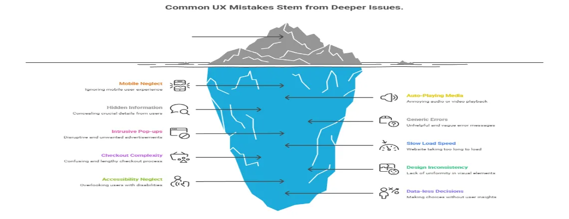
Even experienced teams make predictable mistakes, damaging user experience. Spotting these pitfalls saves time, money, and user frustration. Avoiding these pitfalls ensures a smooth website user experience.
Mistake 1: Ignoring Mobile Users
Mobile traffic exceeds desktop in most industries, yet many sites prioritize desktop. Tiny tap targets, horizontal scrolling, and hover-dependent interactions frustrate mobile users. Solution: Design mobile-first, then enhance for larger screens. Test on actual devices.
Mistake 2: Auto-Playing Audio or Video
Unexpected sound jolts users. Autoplay burns bandwidth and battery. Solution: Let users decide when to start media. If autoplay is necessary, mute by default with visible unmute controls.
Mistake 3: Hiding Important Information
Too many accordions, tabs, or collapsed sections bury the content users need. Solution: Show critical information by default. Use progressive disclosure only for supplementary content.
Mistake 4: Using Generic Error Messages
“Error 404” or “Invalid input” gives nothing actionable. Solution: Write specific error messages explaining problems and next steps. “Email address should include @ symbol” helps users correct mistakes.
Mistake 5: Implementing Intrusive Pop-ups
Immediate pop-ups begging for emails before users experience value create frustration. Google penalizes intrusive interstitials. Solution: Delay pop-ups until users engage. Make close buttons obvious. Consider slide-ins or static banners.
Mistake 6: Neglecting Page Load Speed
Slow websites lose users before they see content. Every additional second cranks up bounce rates. Solution: Audit performance regularly using Google PageSpeed Insights. Optimize images, minimize code, and use CDNs. Make speed a top priority.
Mistake 7: Creating Complicated Checkout
Every extra step increases abandonment risk. Forcing account creation, asking unnecessary information, and hiding costs frustrate users. Solution: Offer guest checkout. Show total costs upfront. Use progress indicators. Save cart contents.
Mistake 8: Using Inconsistent Design
When buttons look different across pages, navigation bounces around, terminology changes, users waste mental energy relearning the interface. Solution: Create and follow design systems. Use consistent colors, typography, spacing, and interaction patterns.
Mistake 9: Ignoring Accessibility
Assuming all users interact identically shuts out people with disabilities. Low contrast, missing alt text, and keyboard inaccessibility shrink the audience. Solution: Follow WCAG guidelines. Test with screen readers and keyboard-only navigation. Accessibility benefits everyone.
Mistake 10: Making Decisions Without Data
Personal preferences often clash with actual user behavior. Designing based on opinions leads to underperforming experiences. Solution: Get analytics running, conduct user testing, run A/B tests. Let data steer decisions.
Learning from these mistakes helps create better user experience websites faster. User experience portfolio website examples from successful companies show how dodging pitfalls while implementing the 11 optimization strategies creates a competitive advantage.
Conclusion: The Future of Website User Experience
Website user experience is now a business necessity, not just a design choice. Strong UX optimization encompasses Core Web Vitals, mobile responsiveness, and AI-powered chatbot personalization is ensuring your website is fast, intuitive, accessible, and aligned with user goals.
Google’s ranking signals now reward seamless usability and performance, while research shows better design can boost conversions by up to 400%. The best websites evolve continuously, using usability testing and user behavior analytics to reduce friction and improve every customer journey.
Your next steps:
- Audit site performance and accessibility with tools like PageSpeed Insights, WAVE, and UX audit platforms.
- Fix quick issues, prioritize high-impact improvements, and validate through A/B testing.
- Measure progress with data-driven metrics to refine and enhance user satisfaction.
In 2025 and beyond, success belongs to websites that treat UX optimization as an ongoing process is building trust, speed, and accessibility into every interaction.
Frequently Asked Questions (FAQs)
Website UX is how users interact with your site, including design, navigation, speed, and content readability.
Good UX increases user retention, reduces bounce rates, and can boost conversions by up to 400%.
Core Web Vitals are Google metrics measuring page load speed (LCP), interactivity (FID), and visual stability (CLS).
Optimize images, compress CSS/JS, enable caching, use CDNs, and reduce server response time.
Designing for mobile devices first, then scaling for desktop, ensuring responsive, thumb-friendly layouts.
Limit main menu items, use clear labels, breadcrumbs, and include a search function.
Accessible websites reach more users, comply with WCAG standards, and improve usability for everyone.
AI personalizes content, recommends products, and provides instant support via chatbots.
Ignoring mobile users, slow pages, intrusive pop-ups, inconsistent design, and poor forms.
Use analytics, A/B testing, heatmaps, user feedback, and iterate based on data-driven insights.

Daniel Wong
Technical Content Writer
My name is Daniel Wong, a Technical Content Writer from Singapore with a strong interest in AI-powered tools and digital automation. At ChatBoq AI, I focus on creating practical and easy-to-follow content that helps businesses and individuals understand how chatbots work and how to use them effectively.
I enjoy breaking down complex topics like natural language processing (NLP) and conversational AI into simple guides that anyone can follow. Each article is based on careful research, real-world examples, and testing to ensure accuracy and reliability.
Through ChatBoq AI, my goal is to provide readers with trustworthy insights, step-by-step tutorials, and the latest trends in chatbot technology.
✍️
Expert in AI & Chatbot Technology
Leave A Comment